
5 Tips for Designing a Company Logo
01 Jun 16 |
When it comes to company branding, perhaps nothing is more important than having the right logo.
A logo is a symbol that helps people—hopefully your customers, clients, shareholders, etc.—quickly identify your brand. A good logo can drive business toward your company and website, while a bad one can go completely unnoticed or even drive people away.
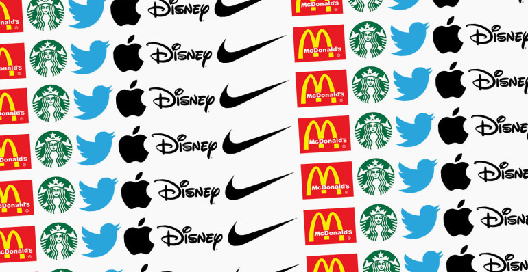
The Nike Swoosh and McDonald’s golden arches are two trademarked logos recognizable the world over.
Here are 5 tips for designing the perfect logo for your company:
- Seek outside help. If you don’t have a dedicated graphic designer working on your team, you will definitely want to contract out for your logo design. It’s both an art form and a science, so you want someone highly trained and qualified to do the job. But even if you have a team of talented designers in-house, it’s still wise to get an outside opinion. By bringing in someone who doesn’t have any pre-conceived notions about your company, you allow ideas to flow that your team may never even have considered. At the end of the day, its still your decision, but it’s always a great idea to see what others have to say.
- Keep it simple. Too many companies fall victim to logos that are so intricate and detailed that it takes people forever to figure out what they are. You want a logo that makes sense instantly. Remember: less is more. But don’t go so simple that the viewer can’t differentiate you from the rest.
- Pay attention to color. Did you know that marquees with more reds and yellows are more appealing to hungry folks than blues and greens? It’s true. That’s why the successful fast-food places all have signs and logos that are heavy on the warm colors (think MCDonald’s, Burger King, In & Out, Wendy’s, Carl’s Jr.). The color you choose for your logo can make or break you, so be sure to pick one that works and that matches your company’s design as a whole.
- Consider a logotype. While companies like Melaleuca.com effectively use images as logos, you may want to try a clever logotype or word mark. Simply put, a word mark is a logo that consists of text only. Recognizable word marks include the Disney and Coca-Cola logotypes. All they use is a typographic treatment of the company name, but there may not be two more recognizable and adored logos on the planet.
- Don’t be afraid to rebrand. You may have been using the same logo for decades, but perhaps it’s time for a change. A new logo signals change, and it may be the communication your customers and clients, both existing and potential, are waiting for to think to themselves, “Hey. These guys are doing some exciting new things. I like it.”