
Web designer Depot gets a redesign

23 Dec 16 |
If you visit often, you should easily notice most of the changes, however, if you just drop by once in a while the site will feel similar yet different. In fact, if we did our job right, it should feel more minimal, more elegant as well as easier to read.
When we set out to redesign WDD, we wanted to achieve a better user experience by embracing a more minimalist approach, simplifying and speeding up the site.
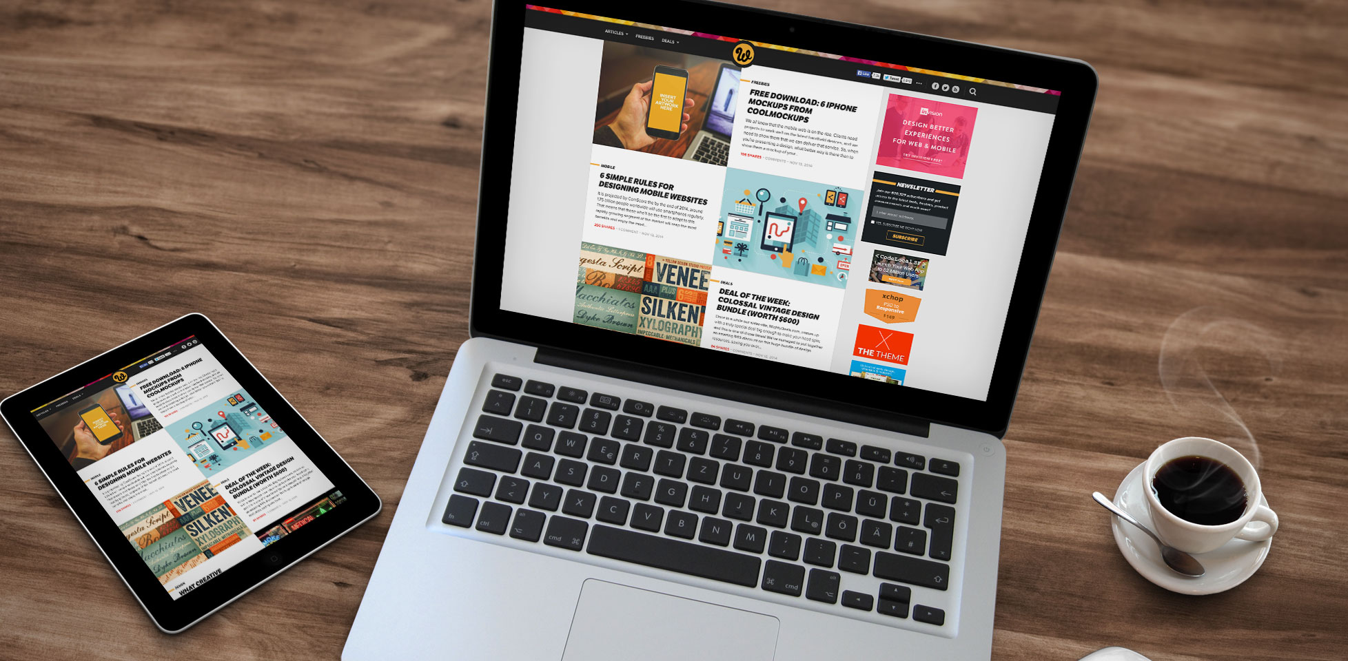
We considered a magazine layout for the new design, but it felt impersonal and overwhelming with way too much content and looked somewhat messy as well. We went through countless iterations before deciding to follow this direction. Around the web, we’re seeing more and more content being displayed these days on sites (especially tech sites) that overwhelm the users with too much choice. We believe that this new layout feels more intimate, personal and easier to browse, being somewhat like a cross between a traditional blog and a magazine style site without overpowering the user experience.
The sidebar has been minimized. It’s now narrower and even the 200×125 ads, which are now displayed one at a time, seem to breathe easier with ample white space around them. Originally we removed the larger 300×250 ad on top of the sidebar in order to create a super tiny sidebar with just the 200×125 ads, but this created a problem for some of our sponsors who advertise heavily in that top spot.
We also experimented with removing the sidebar altogether, yet when trying to integrate the sidebar content and especially the ads within the content into a single column, the layout became heavy and disorganized. If WDD was free of ads, we would have probably taken a sidebar-less approach. For now though, ads are still necessary to run the site and pay for the bills, but with this approach we feel they’re less obtrusive and serve both our advertisers and readers best.
One of the ideas that we wanted to integrate early on was infinite scrolling. We asked our readers through our social channels for feedback on this and did some thorough research and found out that it would be mostly negative for our purposes. We believe that infinite scrolling will work best for sites with mostly images, but not necessarily for a blog where it seems to result in less user engagement (readers just scroll and scroll, yet they engage less with the content). Of course, there are always exceptions, but for WDD for now, we’re sticking with a traditional pagination approach and saying “no” to infinite scrolling.